Executive Summary
Your choice of font can have a large impact on how your content is both perceived and read. To enhance the readability of your content, it is important to limit the number of font styles while also choosing fonts with distinguished characters (e.g., I, l, and 1 [capital I from lower case l from numeral 1). You should also take into consideration the size of your text and the color of your text to ensure it stands out from the background or surrounding text. It is also encouraged to avoid using images of text. These steps will improve both the readability and the overall perception of your content.
Page Contents
Introduction
The choice of font can have an impact on the way your content is perceived: outdated vs. timely, amateur vs. sophisticated, etc. The style of your text is important, but your choices can also impact the readability and comprehension of your content. It is also important to remember that in many modern technologies, the user can have their software override an author's chosen fonts, font sizes, and other characteristics.
Font Style
Fonts are grouped into categories based on similar characteristics in each font. The most common types of font families are serif, sans serif, cursive, fantasy, and monospace. From these top five families, the two most common font families are serif and sans serif.
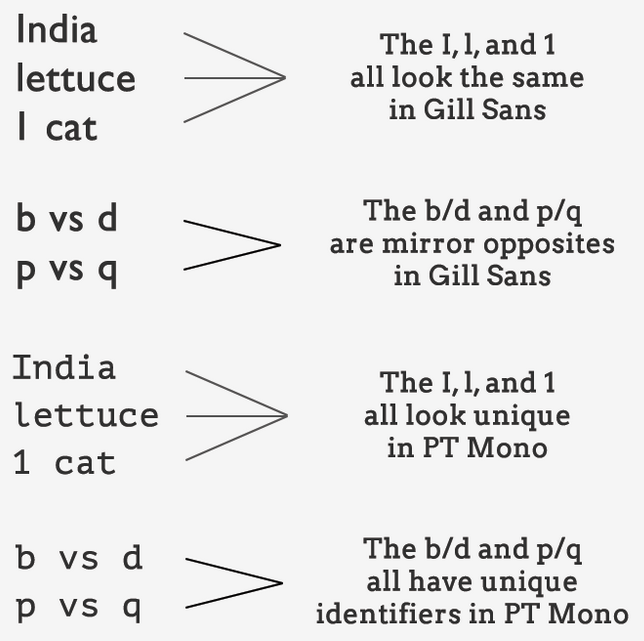
For users with a visual impairment, reading disability, or learning disability, certain letters or combinations of letters can be confusing due to the lack of defining characteristics. Because of this, it is important to choose fonts that have strong and unique characters. One characteristic to look for in a font is the distinction between a capital "I," a lowercase "l" and the number "1." A second characteristic to look for is a distinction with mirror-opposite letters such as lowercase "b" and lowercase "d" as well as lowercase "p" and lowercase "q." Choosing a font that meets these criteria will result in a more accessible font.
Number of Fonts
When choosing fonts, it is recommended to limit the number of fonts appearing throughout your content. Using too many fonts can become visually confusing to users navigating your content, but also can create a difficult environment for users with reading disabilities, learning disabilities, or attention deficit hyperactivity disorder (ADHD). In general, staying within two to three different fonts is considered best practice. Having different font styles for headings and bodies of text is acceptable but should be consistent throughout the document or webpage.
Readability
Depending on the medium you are using, there can be many fonts available to use. When choosing a font, it is important to make sure you are using a standard font that most people will have available to them. Standard fonts, such as Arial, Calibri, Times New Roman, etc., are often available on most users' devices and tend to be more readable than specialty fonts. Narrow, bold, and decorative fonts should be avoided, as these can be harder to read. The use of all-capital letters also should be avoided, as this makes text harder to read. The use of all-capital letters also can create confusion for screen reader users, as the software sometimes will read out each letter individually instead of a full word.
Size
The size of your text is just as important as the font being used in your content. According to WCAG standards, text should be 12pt or larger. Keep in mind that size among fonts is not always equal and 12pt in one font may appear smaller than 12pt in a different font.
For websites, font sized can be defined in many ways: ems, rems, pixels, and points. Ems and rems are relative font sizes and allow for scalability in text, whereas fixed units such as pixels do not. Making use of relative font sizes in your content is required, as it will result in a more responsive layout that works across several screen sizes and magnification.
Real Text vs. Images of Text
When including text in a document or on a webpage, it is essential that text is used instead of images of text. Images of text cannot be perceived by assistive technology, such as a screen reader, unless added alternative text is provided for the image. This also causes issues for users who make use of screen magnification tools because images can decrease in quality and become pixilated when resized. The readability of text within images can be inconsistent and is therefore discouraged. The use of real text instead of images of text also provides easier access to those who require content to be translated into other languages and benefits users who might have unreliable internet connection where images will not load.
Color Contrast
Color is an effective way to incorporate design aspects into your documents and websites. However, it is important to make sure that fonts and images have enough contrast or use other mechanisms to help visually impaired users interact with the content. When considering the text you will be using in your content, it is important to note that text is much easier to read when sufficient contrast exists between the text and the background.
Color contrast ratio is defined as the ratio between the brightest color to that of the darkest color, with the highest ratio being black to white. When color is used as the visually distinguishing technique, the minimum contrast ratio allowed between regular text and the color-distinguished text is 3:1 for AA and 4.5:1 for AAA. For foreground-to-background, the minimum requirement is at least 4.5:1. To reach a wider audience, the AAA standard is 7:1—so we recommend going beyond the minimum 4.5:1 for the contrast ratio foreground to background and beyond the minimum 3:1 for differentiating between colors.
For more information about color contrast and MSU brand standard colors, please visit the Color Contrast tutorial.