Executive Summary
Alternative text is text used to describe information being provided by an image, graph, or any other visual element. When a screen reader user encounters an image, the software will read aloud the alternative text to provide a similar experience to that of a visual user. Alternative text is required for all visuals that provide meaningful information. Images used for decoration do not require alternative text but should be marked as decorative when available. Alternative text should be short and concise, generally a few words to a sentence will suffice, but should still convey the same information as the image. Details for proper image accessibility in different document types will be available in the tutorial for the document type, e.g., Microsoft Word, HTML.
Page Contents
- Introduction
- Elements that Require Alternative Text
- Meaningful and Complex Images
- Decorative Images
- Caption vs. Alternative Text
Introduction
Alternative text is text that describes visuals, such as images, clip art, charts, and graphics. The objective of alternative text is to serve the same purpose and convey the same information as the image being provided. Alternative text ensures the same experience for persons using assistive technologies, such as a screen reader, as well as those with varying degrees of visual or cognitive impairments.
Elements that Require Alternative Text
If a visual is being used to convey information, alternative text is required. This includes, but is not limited to:
- Images
- Clip art
- Smart art
- Charts
- Graphs
Meaningful and Complex Images
When creating alternative text for meaningful (images relevant to the content) and complex images, take into consideration the guidelines below:
Context
Alternative text for images might vary depending on the context surrounding them. Context should be used to avoid repetition of text surrounding the image, as well as basic concepts and terms that the user is already familiar with.
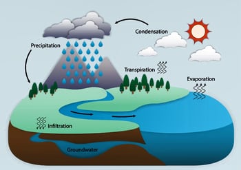
Alternative Text: "Water cycle: evaporation and transpiration, condensation, precipitation, infiltration, groundwater."
Rationale: This image is being used at the end of a lecture in a summary section of the water cycle. Since the water cycle has been explained in detail throughout the lecture, more information about each stage in this image is not needed.
Audience
When writing alternative text, it is important to take your audience into consideration. If the image is being used in a lecture, think about what your audience already knows. Use vocabulary and phrases that are appropriate for your audience. Use of details or examples that the user will understand will make your alternative text description most effective.
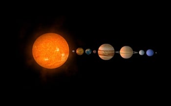
Alternative Text: "Solar system from closest to the sun to farthest: Mercury, Venus, Earth, Mars, Jupiter, Saturn, Uranus, Neptune and Pluto."
Rationale: This image is being used in an introductory astronomy course. Students are not expected to have any previous knowledge of the solar system, therefore, including the order of planets in the description is necessary.
Concise
Alternative text should be as descriptive as is appropriate. No more than a few words are necessary, but a short sentence or two might be appropriate in some instances. Do not be redundant: information previously presented in surrounding text should not be repeated.
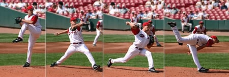
Alternative Text: "Series of four photos depicting the baseball pitching sequence: the first shows the windup, the second shows the beginning acceleration, the third is the final moments of acceleration, and the last shows the follow-through."
Rationale: My alternative text is kept short and concise. This graphic has a lot of detail, but the important part we are focusing on is the chain of events happening in each still. Therefore, the excess details have been left out.
Objective
When creating alternative text, it is important to remain objective. Do not interpret or analyze the content for the user. Your description should include only what is seen, since the purpose of alternative text is to provide the user with the same information as a sighted user. For images that require additional information for comprehension or a takeaway interpretation, this should be reflected in the text surrounding the image, not in the alternative text. The following example is a bar chart image followed by two options: one includes alt text that references a following table that includes all the data in the bar chart, and the second option shows a less-recommended approach that is often necessary with third-party documents such as PDFs.
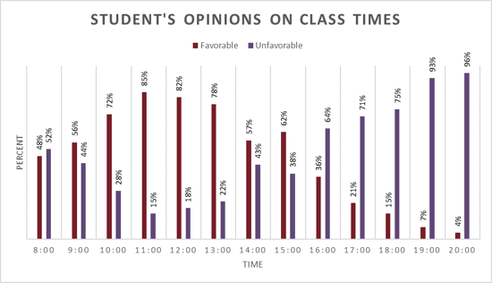
Option 1 (Recommended):
Alternative Text: "Multi-bar graph titled ‘Student’s Opinions on Class Times.’ See ‘Student’s Opinions on Class Times’ table below for data"
Student's Opinions on Class Times
| Time | 8:00 | 9:00 | 10:00 | 11:00 | 12:00 | 13:00 | 14:00 | 15:00 | 16:00 | 17:00 | 18:00 | 19:00 | 20:00 |
|---|---|---|---|---|---|---|---|---|---|---|---|---|---|
| Favorable | 48% | 56% | 72% | 85% | 82% | 78% | 57% | 62% | 36% | 21% | 15% | 7% | 4% |
| Unfavorable | 52% | 44% | 28% | 15% | 18% | 22% | 43% | 38% | 64% | 71% | 75% | 93% | 96% |
Rationale: When given the opportunity, data should be formatted in a table. In this case, the owner of the graph would be able to provide the data in a table beneath the graph. Providing the data in a table below the graph allows for ease of access to information for those using assistive technologies as well as low-vision users. If you are not the owner and do not have access to edit the formatting of information, alternative text option 2 would be the option to choose.
Option 2 (Not Recommended):
Alternative Text: "Multi-bar graph titled 'Student's Opinions on Class Times'. The x-axis is labeled time and the y-axis is percent. For each time there is a favorable percentage and an unfavorable percentage. 8:00: favorable 48%, unfavorable 52%. 9:00: favorable 56%, unfavorable 44%. 10:00: favorable 72%, unfavorable 28%. 11:00: favorable 85%, unfavorable 15%. 12:00: favorable 82%, unfavorable 18%. 13:00 favorable 78%, unfavorable 22%. 14:00: favorable 57%, unfavorable 43%. 15:00: favorable 62%, unfavorable 38%. 16:00 favorable 36%, unfavorable 64%. 17:00: favorable 21%, unfavorable: 71%. 18:00: favorable 15%, unfavorable 75%. 19:00: favorable 7%, unfavorable 93%. 20:00: favorable 4%, unfavorable 96%."
Rationale: The graph is being used as a stand-alone image to convey data that students must know. Because of this, each data point has been listed out. Notice how the data has not been interpreted or analyzed for the user in the alternative text. If each data point were not necessary knowledge, general trends of the graph could be used in the description instead.
Language
Alternative text should use descriptive language that adds meaning. Avoid using the phrase "image of..." or "graphic of..." at the beginning of your alternative text. If the medium of the image is important, such as a map, drawing, screenshot, photograph, etc., then that would be useful to include at the beginning of your alternative text. Abbreviations and symbols should be written out to ensure accuracy from a screen reader. Lastly, confirm spelling, punctuation and grammar are accurate throughout your description.
Decorative Images
Decorative images are images that provide no information and are used for purely aesthetic purposes. Decorative images do not need alternative text but should be marked as decorative (when the option is available).
Alternative Text:
Rationale: This photograph of Abraham Lincoln is located in a biography about his life. There is no significance of this image in the text, it is solely for decorative purposes, therefore the alt text would be left blank and the image would be marked as decorative if available.
If this image were being used to showcase a photography style, or as an example of Abraham Lincoln's appearance throughout his life, then the alternative text would need to reflect that.
Caption vs. Alternative Text
If an image you are using already has a caption, it might not need additional alternative text. Read the caption and decide if it is enough. If the caption is brief or missing key information, these should be added to the alternative text.
Any relevant information that is not describing the image itself, such as the source of the image, permissions, or copyright information, should be placed as a caption below the image, not in the alternative text.