Introduction
Microsoft PowerPoint has a number of tools you can use to make documents more accessible. This tutorial will help with the Microsoft 365 desktop version of PowerPoint through the use of these features.
For additional support with other versions of PowerPoint, check out the support page on the Microsoft website.
Things to Consider:
- No automated automated accessibility checker will ensure that a document is fully accessible.
- Automated checkers are a good starting point when checking your documents for common accessibility issues and should be used as a regular part of document creation workflows.
- We recommend using the local, installed desktop version of Microsoft Office applications when checking documents for accessibility. Some features and functionality are missing or not working properly in the online versions, including the Accessibility Checker tool.
- Accessibility checking requires manual inspection and some human judgment (e.g. “What is meaningful alternative text for an image?” WCAG 1.1.1).
- Microsoft provides a guide outlining the Accessibility Checker rules, including the distinctions it makes between Errors, Warnings, and Tips. It also offers manual inspection recommendations for document creators.
- All MSU faculty, staff, and students can download Microsoft 365 applications for their local devices at no cost on the MSU Microsoft 365 website: spartan365.msu.edu.
PowerPoint Accessibility Checklist
- Do your links provide descriptive text in context that describes their destination to the user?
- Do your images have appropriate alternative (alt) text which describes images within the context they appear?
- In slides where visual design is done within PowerPoint, have you grouped information and provided alternative text such that visual diagrams can be easily and equivalently understood by screen reader users?
- Do each of the slides have a unique title that appropriately describes the content of the slide?
- Does your document make use of list styles (either bullets or numbered lists) where appropriate?
- Are each of your slides organized in a way that conveys meaning in the correct reading order?
- Do your tables have designated heading rows?
- Does your slideshow generally use light text on a dark background or dark text on a light background, or have you verified the color contrast using an accessibility tool (please consider using the colour contrast analyser)?
- Have you run Microsoft PowerPoint's built-in accessibility checker, and fixed any identified problems?
PowerPoint: Added Context
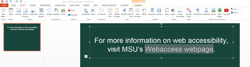
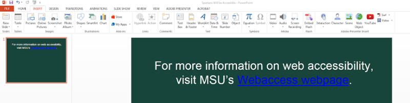
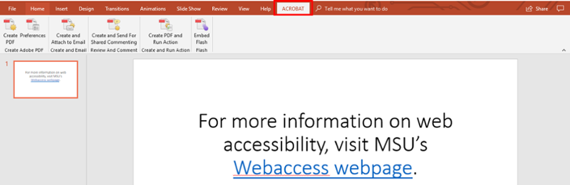
Added context is the use of descriptive titles, headers, and hyperlinks to describe content that allow users to navigate effectively through documents. For individuals who use assistive technology, links should convey clear information about the destination. Instead of leaving the URL or linking to text labeled “Click here,” include descriptive text around the link to explain the destination of the link.
Wrong:
For more information click here.
Correct:
For more information on web accessibility, visit MSU’s Webaccess webpage.
This is recommended for when designing a document to be printed, such as a syllabus.
For more information please visit MSU’s web accessibility site at www.webaccess.msu.edu.
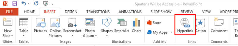
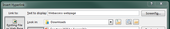
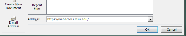
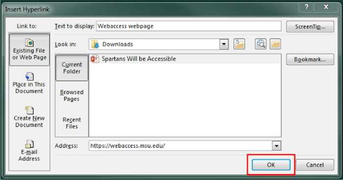
How to add meaningful hyperlink text in a PowerPoint:
-
Select the descriptive text that describes the destination of the link.
-
On the Insert tab, under the Links group, select the “Hyperlink” icon or use Ctrl+K.
-
An Insert Hyperlink box will appear.
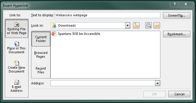
-
The “Text to display” textbox should be the descriptive text that was selected.
-
In the “Address” textbox, type in the link that the descriptive text is linking to.
-
Select “OK.”
How to change hyperlink text color:
To change the text color of a hyperlink in a theme visit the Microsoft Office website.
PowerPoint: Alternative Text
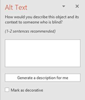
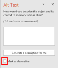
Alternative (alt) text helps individuals who are unable to view and read a screen on their own. Individuals may rely on assistive technology, such as screen readers, to communicate the provided content. Alt text is text that describes visual images or objects within the context that they appear. Decorative images are images that provide no information and are used for purely aesthetic purposes. Decorative images do not need alt text.
When writing alt text, it is important to remember that users will not see your information, they will hear it. Alt text should provide the same information as someone who can visually see the image. Assistive technology will inform the user that the object is an image, so you do not need to state in the alt text that it is an image, simply describe the image as you would describe it over the phone to someone. For charts, you should describe the type of chart, and consider defining the axes, and the general trend of the graph. For example, “A line graph of temperature by week.” If the goal of an assignment is to determine the general trend, consider defining a small subset of data points that allows users to determine trend, or also providing a table.
Visual content that requires alt text:
- Pictures
- Clip art
- Charts
- Tables
- Graphics
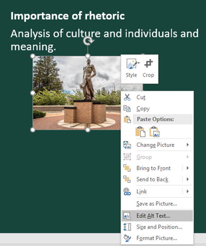
How to add Alternative Text to an image in PowerPoint:
-
Select the image that needs alt text.

-
Right click on the image. Select “Edit Alt Text" at the bottom of the drop-down menu.
-
An Alt Text panel will appear on the right side of the screen. In the text box, add text describing what the image is. When writing alternative text, think about how you might describe a visual over the phone.
-
If the image is a decorative image and provides no additional information to the user, select the checkbox next to "Mark as decorative.”
-
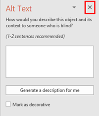
Close (X) the sidebar when finished.
How to add Alternative Text to a table in PowerPoint:
-
Select the table that needs alt text.
-
Right-click on the table, Select “Format Shape” at the very bottom of the drop-down menu.
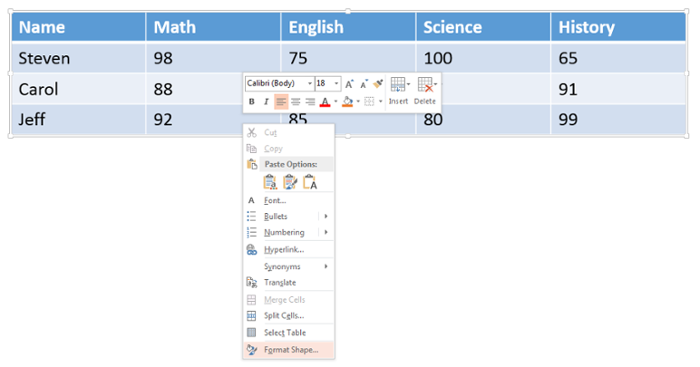
-
In the Format Shape panel that will appear on the right side of the slide, select the “Size & Properties” icon (it looks like a square with arrows and measurement bars around it).
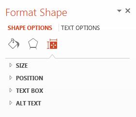
-
Select Alt Text, located at the very bottom.
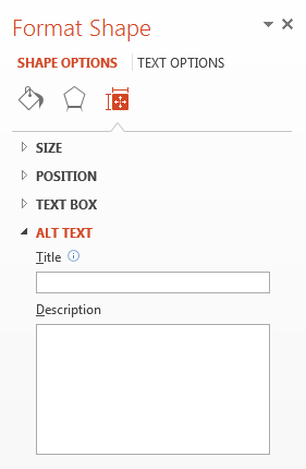
-
In the TITLE field, add the title of the table. In the DESCRIPTION field, add text describing what the table displays.
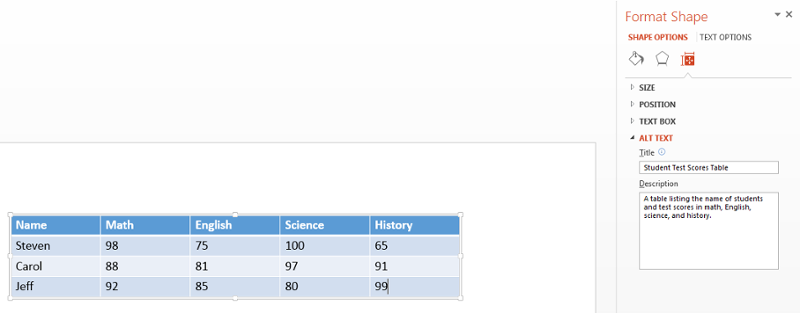
-
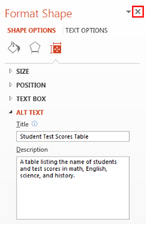
Close (X) the sidebar when finished.
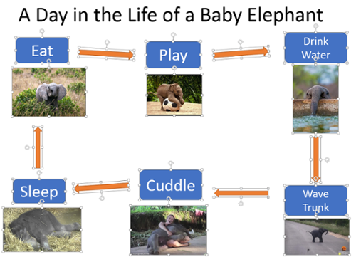
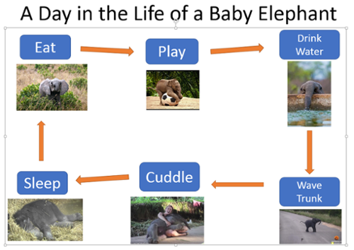
Complex visual objects in PowerPoint:
It is a common practice to develop concept maps or flowcharts in order to better articulate some of the points being addressed in the presentation. However, if left as is, a simple flow chart creates a lot of separate elements in the selection pane that makes it difficult for a screen reader user to understand content. Another layer of complexity is added because each individual line and shape needs its own alt text and needs to be in the correct reading order.
The best method for condensing elements and articulating key points from visual graphics is to screenshot the graphics to create one image, upload the image, and add alt text to describe the image. If an image is one visual argument, then this is the best way to succinctly provide alternative text. If you decide not to upload the image as a whole, be sure to add alternative text to each separate element and then arrange them in the correct reading order.
How to use the Snipping Tool:
- To find the Snipping Tool on a PC, select the “Start” button on the taskbar.
- In the search bar, search for “Snipping Tool,” select to open the tool.
- “New” allows the user to take a new screenshot; the down arrow provides different “snip types” options.
- Click and drag over the image you want to screenshot.
- Once a screenshot is taken, the image will appear on the screen.
- Select “File,” then “Save As” to create a file name and location for the image.
How to screenshot the existing visual and add Alternative Text in PowerPoint:
Screenshot:
-
Take a visual created with individual elements.
- Use the Snipping Tool on a PC to screenshot and crop the image.
- Save this image to your desktop.
- Delete the original visual from the PowerPoint slide.
-
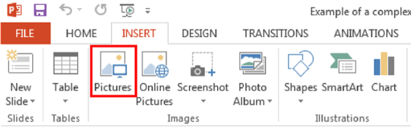
On the Insert tab, in the Images group, select “Pictures."
-
Select the screenshot image from its location on your desktop and select “Insert” to place it into the PowerPoint slide.
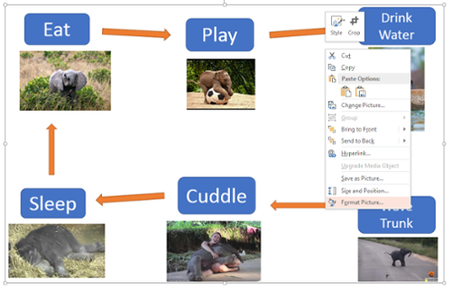
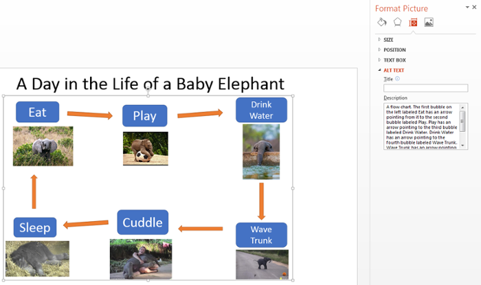
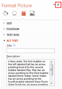
How to add Alternative Text to a complex image in PowerPoint:
-
Right click on the image, select “Format Picture” at the very bottom of the drop-down menu.
-
In the Format Picture panel that will appear on the right side of the slide, select the Size & Properties icon. It looks like a square with arrows and measurement bars around it.
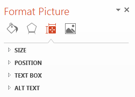
-
Select Alt Text, located at the very bottom.
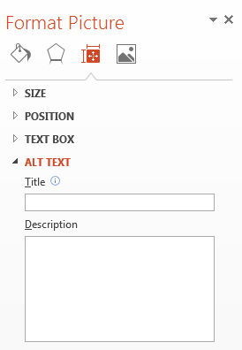
- In the DESCRIPTION (not the Title field), add text describing what the image is and what each piece of the visual is in relation to the others.
- For example, in a flow chart, start by saying “The first bubble on the left labeled Teamwork has an arrow pointing from it to the second bubble labeled Makes the dream work.”
- For example, in a flow chart, start by saying “The first bubble on the left labeled Teamwork has an arrow pointing from it to the second bubble labeled Makes the dream work.”
-
Close (X) the sidebar when finished.
PowerPoint: Heading Styles
Titles give the user an indication of where they are in the presentation when navigating through the content. When using assistive technology, titles are the main method of navigation. It is important to note that every slide requires a title.
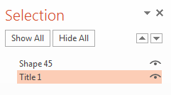
How to check to make sure each PowerPoint slide has a “Title” element:
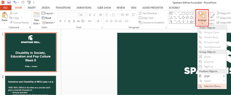
Many title elements are not given the proper Title name within the reading order, and are instead listed as something else, for example “TextBox1” or “Rectangle 1.” However, by properly labeling a title text box as a Title attribute in the Selection Pane, the screen reader will better understand the hierarchy of information on the slide. To do this:
-
Open the Selection Pane by selecting “Arrange” on the top Microsoft Ribbon under the Drawing group. A drop-down menu will appear at the bottom. Select “Selection Pane.”

- Once the Selection Pane is open, drag each element up or down to move it into the correct reading order. REMINDER: When organizing the reading order in PowerPoint, in the “Selection Pane,” instead of the first element being read off first it is actually read off last so the order is flipped, meaning the elements are read from the bottom to top in the selection pane.
-
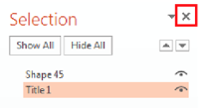
To change the name of the text frame that is intended to be the title, simply double click on the bottom element in the selection pane and type “Title 1.” This indicates to a screen reader that this is the title of the slide.

-
Close (X) the sidebar when finished.
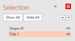
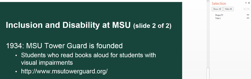
If the content on the slide is a continuation of the previous slide and you do not want to include a title for visual purposes:
-
Type the title in a text frame, and make sure the title is correctly placed and labeled in the selection pane. This can be done by labeling the title "slide 1 of 3." You may click the small “eye” icon to the right of the Title 1 element—it will become a straight horizontal line. This will eliminate the Title from view but will still allow assistive technology to recognize the title.
PowerPoint: List Styles
List styles are great tools to organize your content. Using built-in structures like bulleted or numbered lists allows assistive technology like screen readers to clearly convey information to users, and allows users to effectively navigate through content.
How to format lists:
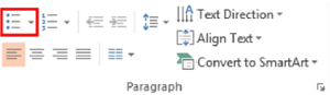
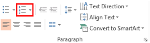
- Select content to format.
- On the Home tab, in the Paragraph group, select the Bullets or Numbering icon.
-
Use Bulleted (unordered) lists when items have equal value.
-
Use Numbered (ordered) lists when items are in sequential order.
Bullets List Example:
- 1 cup of water
- 1 stick of butter
- 3 eggs
Numbering List Example:
- Heat oven to 350 degrees
- Beat cake mix, water, butter, and eggs in large bowl
- Bake as directed
PowerPoint: Multiple Avenues for Multimedia
Multimedia, such as audio, video, and interactive media, can be made accessible through transcripts and closed captions. Make sure your video or animation does not contain flashing elements with a frequency greater than 3 flashes per second, as it can cause individuals to experience seizures. In general, rapidly flashing or blinking content should be avoided, because it can be distracting for individuals with learning and attention-related disabilities, and harmful to some individuals who might experience seizures.
Guideline 1: Audio-only formats should have transcripts or captioning.
How to add captioning:
- Create your own: To create your own captioning in YouTube and Camtasia, visit the caption creation guide.
- Use a third party: To hire a third-party captioning service, visit the third-party captioning service guide.
Guideline 2: Video should provide accurate closed captions.
How to add closed captions:
- Mediaspace
- Youtube
Tips to create accessible videos to put into a PowerPoint:
In a video where you are demonstrating a process or teaching a concept:
- Try to describe the actions that are taken to complete the steps in a process so that users with various disabilities can follow along.
- Describe/summarize visual information that appears on the screen in the narration track.
PowerPoint: Reading Order
The reading order of each slide is the order in which elements on a page are read by assistive technology. Reading order is programmatic and should generally be read top-down, and left-right for English text/diagrams.
How to edit and change the reading order in PowerPoint:
-
Open the Selection Pane by selecting “Arrange” on the top Microsoft Ribbon under the Drawing group. A drop-down menu will appear. At the bottom, select “Selection Pane.”
-
Once the Selection Pane is open, on the right-hand side of the screen simply drag any element up or down to move it in the correct reading order. REMINDER: When organizing the reading order in PowerPoint, in the “Selection Pane,” instead of the first element being read off first it is actually read off last so the order is flipped, meaning the elements are read from the bottom to top in the selection pane.


-
The title of the slide should always be the bottom element in the selection pane order. The first element to be read should be at the bottom of the selection pane, the next element to be read should be second-to-last in the selection pane order, and so on. If you want your title to be invisible, you can hide the title by selecting the eye icon.

-
Close (X) the sidebar when finished.
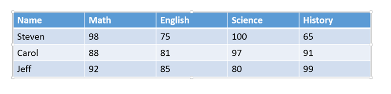
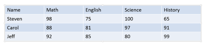
PowerPoint: Tables
When creating tables, be sure to use a simple table structure, with column and row header information. This will let individuals with assistive technology understand the information the table is providing and keep track of their location in the table.
Tips to create accessible tables:
- Include a title to describe what the table is representing
- Include at least one header row
- Do not leave blank rows or columns
- Do not split cells or merge cells
- Do not create nested tables
- Include alternative text
Additional items to consider:
- Color contrast
- If you have a table that has been embedded as an image, it is suggested to recreate the table in PowerPoint. This will allow an individual with assistive technology to navigate through the table, cell-by-cell. Also, it is more difficult to add alternative text to a table as an image, since it can get lengthy and provide an inaccurate representation of the data.
- Do not make the table too large. Complex tables can be difficult for readers to follow and comprehend, especially for individuals with assistive technology who have to remember headers.
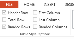
How to add a header rows in PowerPoint:
-
Select the table.
-
In the Design tab, under the Table Style Options, check “Header Row." Make sure the first row is highlighted.
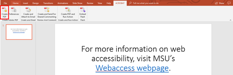
PowerPoint: How to Properly Save to PDF
To save accessible features made in a PowerPoint document to a PDF document, you must save a PowerPoint document properly. Although there are many ways to convert a PowerPoint document to a PDF, it is important to perform this action in a specific way each time to ensure that the accessibility practices implemented remain intact. To complete this action, users need to have Adobe Acrobat Pro installed on their device.
How to properly save a document to a PDF:
-
Select the Acrobat tab.
-
Select “Create PDF.”
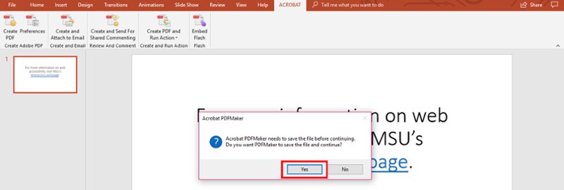
-
An Acrobat Create PDF box will appear.
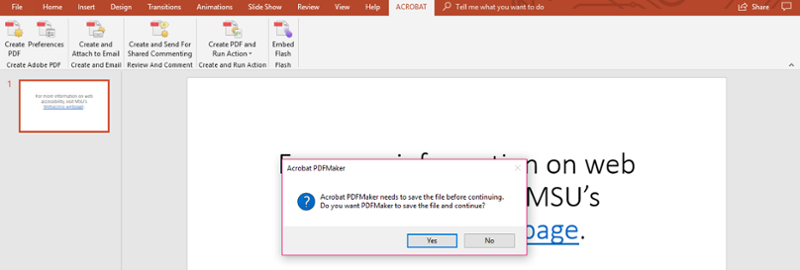
-
Select “Yes." Upon saving or selecting "Yes," the document will open in PDF. This gives the user the opportunity to review the document in its new format.
PowerPoint: Text Styles
Text styles is the use of using more than color to denote the differences between content and the rest of the document. Meaning cannot be denoted by color alone. A way around this would be to include text and color, shape and color, or bold and underlined and color. This will allow a visually impaired individual to identify the differences between content meaning.
Wrong:
Turn in your final exam by Friday at 5 p.m. (In this example Friday at 5 p.m. is colored red for emphasis)
Correct:
Turn in your final exam by Friday at 5 p.m. (In this example, Friday at 5 p.m. is bold)
Wrong:
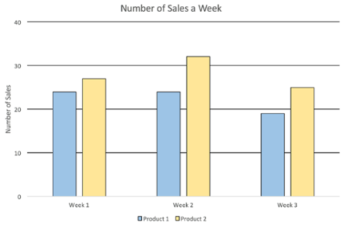
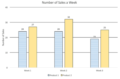
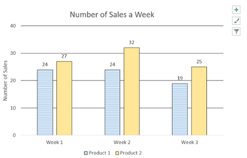
Correct:
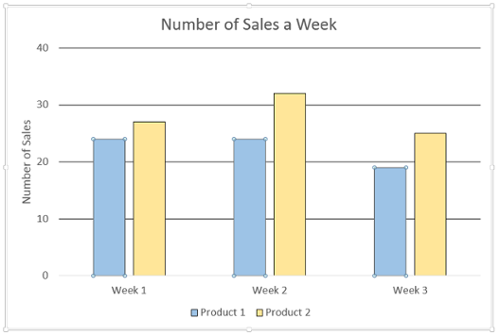
How to add a Pattern fill to a chart in PowerPoint:
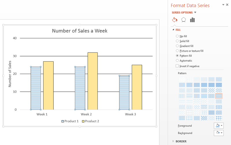
-
Select a bar to highlight, it should highlight all of the bars in the same group. A small circle will appear on each corner of the bars.
-
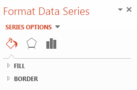
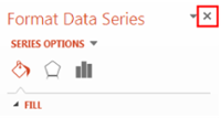
Right-click on the highlighted bar. A drop-down menu will appear. At the very bottom, select “Format Data Series.”
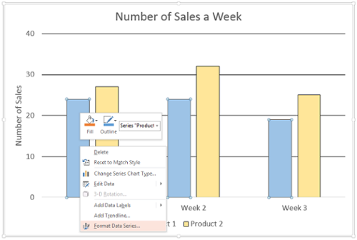
-
A sidebar will appear on the right. Select “Fill & Line,” the first icon of a paint can with paint spilling out.
-
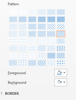
In the Fill section, select “Pattern fill.” A Pattern drop-down will appear.
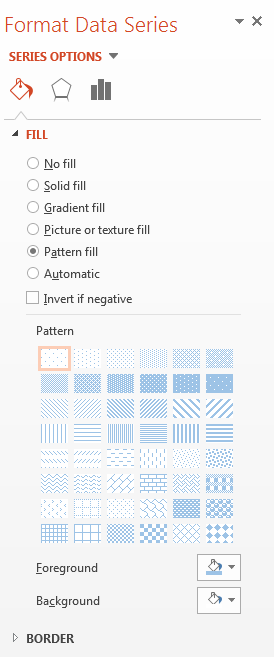
-
Select the appropriate pattern for your chart.
-
To change the pattern color(s), select the “Foreground” or “Background” drop-down of a paint can with paint spilling out.
-
Close (X) the sidebar when finished.
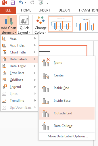
How to add Data Labels to a chart in PowerPoint:
-
Select the chart. In the Design tab, select “Add Chart Element.”
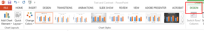
-
On the drop-down menu, select “Data Labels.”
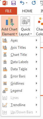
-
On the second drop-down menu, select “Outside End.”
PowerPoint: Equations
Visit the MathType for Equations Tutorial for information on entering equations.
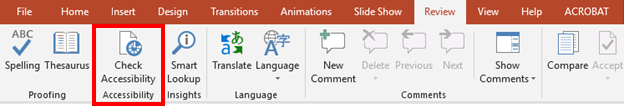
PowerPoint: Accessibility Checker
Microsoft PowerPoint contains a built-in accessibility tool. This lets users perform a double-check on their document to ensure that they have included all basic accessibility practices in their document.
How to access the built-in accessibility checker:
-
Navigate to the Review tab
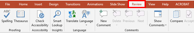
-
Under the "Accessibility" section, select the "Check Accessibility" button. This will run the tool and identify any accessibility related errors that might still be left in the document.