Introduction
Microsoft Word has a number of tools to help make documents more accessible. This tutorial explains how to use the accessibility features for Word in Microsoft Office 365.
For additional support visit the Microsoft website.
Things to Consider:
- Automated checkers are a good starting point but are not capable of finding every type of accessibility issue.
- Accessibility checking requires manual inspection and some human judgment (e.g. “What is meaningful alternative text for an image?”).
- Learn more about the Microsoft Accessibility Checker.
- Office 365 is available at no charge to all MSU faculty, staff, and students. Learn more about Office 365 at MSU.
Covered in this tutorial
- Accessibility Checklist
- Added Context
- How to add meaningful hyperlink text in Microsoft Word
- Word: Alternative Text
- Word: Heading Styles
- How to Properly Save to PDF
- Word: List Styles
- Word: Reading Order
- How to edit and change the reading order in Microsoft Word
- Word: Tables
- Word: Text Styles
- Word: Equations
- Word: Accessibility Checker
- How to access the built-in accessibility checker
Accessibility Checklist
- Are headings used properly to provide structure within your document?
- Do your links provide descriptive text in context which describes their destination to the user?
- Do your images have appropriate alternative (alt) text which describes images within the context they appear?
- If your document has headings designed to help users navigate, have you tagged those headings programmatically as headings?
- Have you saved your document as a PDF in such a way that accessibility information is preserved?
- Does your document make use of list styles (either bullets or numbered lists) where appropriate?
- Do your tables have designated heading rows?
- Does your document avoid using empty spaces to create formatting change?
- Does your document generally use light text on a dark background or dark text on a light background, or have you verified the color contrast using an accessibility tool (please consider using the Colour Contrast Analyser)?
- Have you run Microsoft Word's built-in accessibility checker, and fixed any identified problems?
Added Context
Added context is the use of descriptive titles, headers, and hyperlinks to describe content allowing users to navigate effectively through documents. For individuals who use assistive technology, links should convey clear information about the destination. Instead of using the full web address (URL) or linking to text labeled “Click here,” include descriptive text around the link to explain the destination of the link.
Example of a link with insufficient information:
- For more information click here.
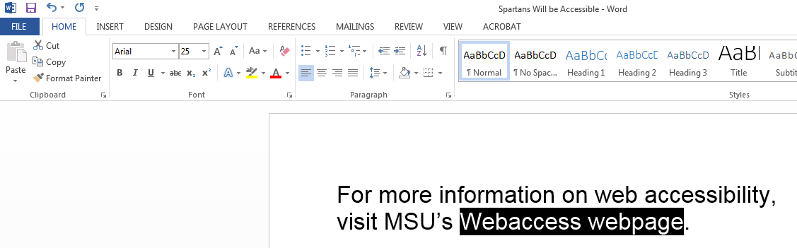
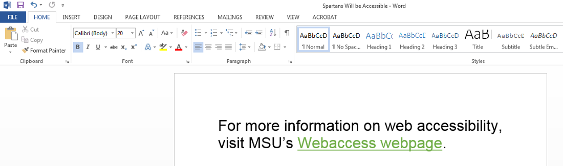
For digital documents where users are able to interact with links, context can be added within the link itself.
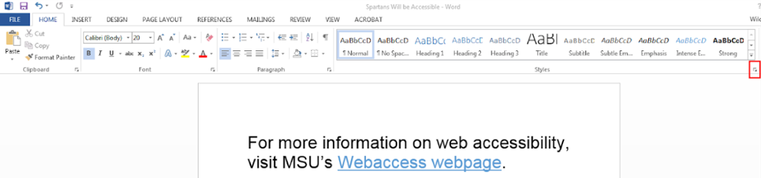
- For more information on web accessibility, visit MSU’s Webaccess webpage.
If you are designing a document that might be printed, such as a syllabus, you can add context around the URL.
- For more information please visit MSU’s web accessibility site at webaccess.msu.edu.
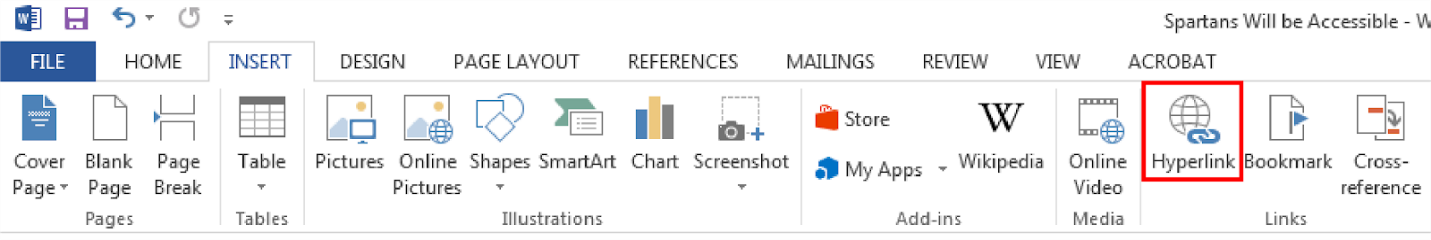
How to add meaningful hyperlink text in Microsoft Word:
- Select/highlight the text that describes the link destination.
- On the Insert tab, under the Links group, select the “Hyperlink” icon, or use Ctrl+K, or right-click and select the “Link” option.
- An "Insert Hyperlink" box will appear.
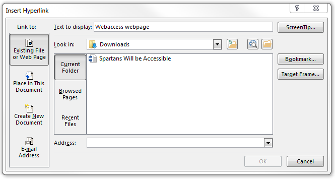
- The “Text to Display” text box should be the descriptive text that was selected.

- In the “Address” text box, type in the link that the descriptive text is linking to.
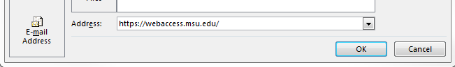
- Select “OK."
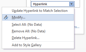
How to change hyperlink text color before link is clicked in Microsoft Word:
-
On the Home tab, under Styles, select the arrow in the corner.
-
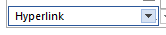
A Styles drop-down menu will appear. Scroll down to “Hyperlink."
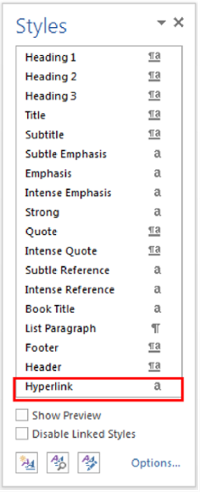
- Select the down arrow.
-
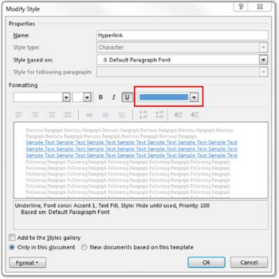
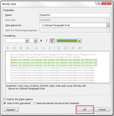
Select “Modify.”
-
A Modify Style box will appear, under Formatting, select the down arrow next to the current hyperlink color titled “Font Color.”
-
Select “OK” to save.
Word: Alternative Text
Alternative (alt) text helps individuals that are unable to view and read a screen on their own. Individuals may rely on assistive technology, such as screen readers to communicate the provided content. Alt text is text that describes visual images or objects within the context that they appear. Decorative images are images that provide no information and are used for purely aesthetic purposes. For this reason, decorative images do not need alt text.
When writing alt text, it is important to remember that users will not see your information, they will hear it. Alternative text should provide the same information as someone who can visually see the image. Assistive technology will inform the user that the object is an image, so you do not need to state in the alt text that it is an image, simply describe the image as you would describe it over the phone to someone. For charts, you should describe the type of chart, and consider defining the axes, and the general trend of the graph. For example, “A line graph of temperature by week.” If the goal of an assignment is to determine the general trend, consider defining in alternative text a small subset of data points that allows users to determine trend, or also providing a table.
Visual content that requires alt text:
- Pictures
- Clip art
- Charts
- Tables
- Graphics
How to add Alternative Text to an image in Microsoft Word:
-
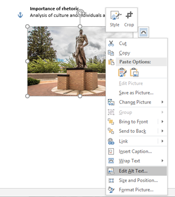
Select the image that needs alt text.

-
Right click on the image, Select “Edit Alt Text” at the bottom of the drop-down menu.
-
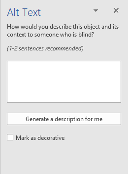
An Alt Text panel will appear on the right side of the screen. In the text box, add text describing what the image is. Think about how you might describe a visual over the phone when writing alternative text.
-
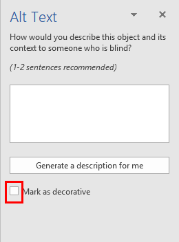
If the image is a decorative image and provides no additional information to the user, select the checkbox next to "Mark as decorative.”
-
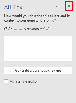
Close (X) the sidebar once finished. Now our image has alternative text.
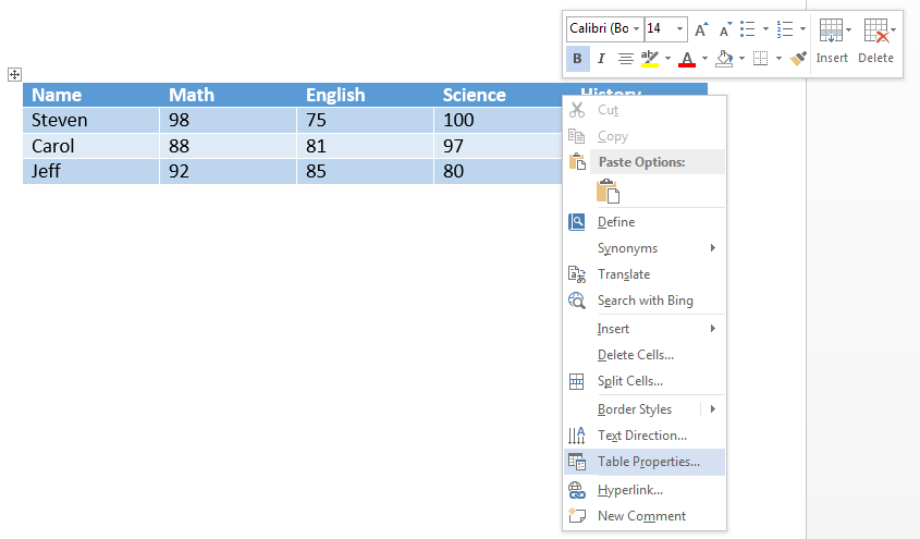
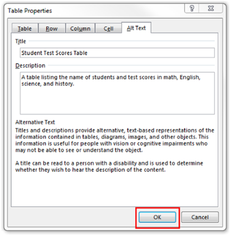
How to add Alternative Text to a table in Microsoft Word:
-
Select the table that needs alt text.
-
Right click on the table, Select “Table properties” at the very bottom of the drop-down menu.
-
A Table Properties box will appear.
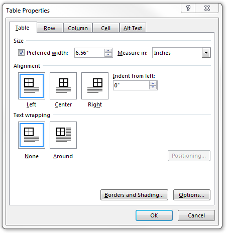
-
Select Alt Text on the right.
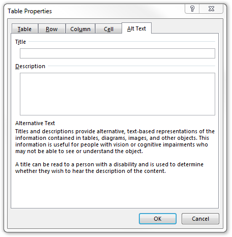
-
In the TITLE field, add the title of the table. In the DESCRIPTION field, add text describing what the table displays. Try to provide contextual information about the table in the description field.
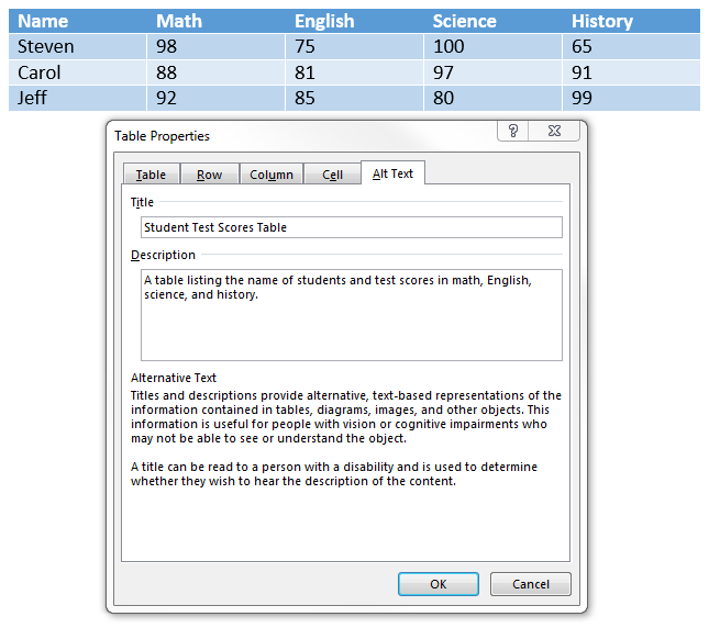
-
Select “OK” to save.
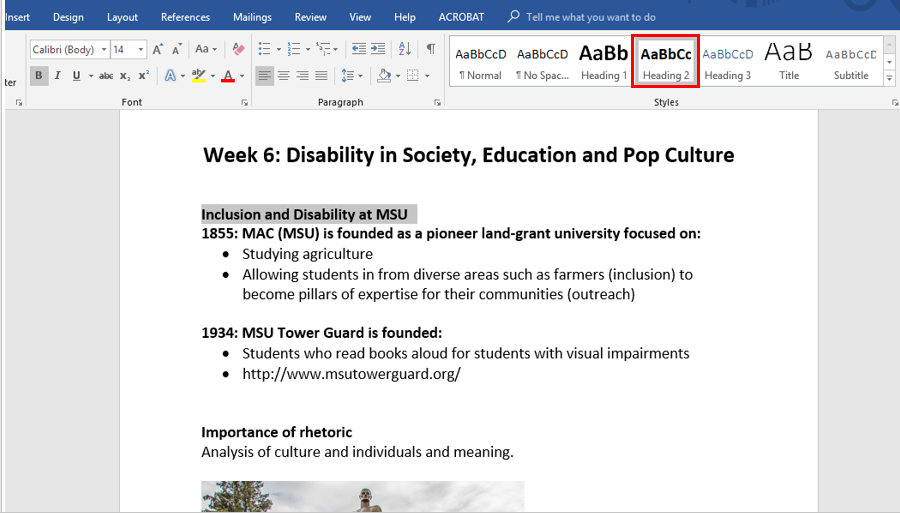
Word: Heading Styles
Headings styles provide structure within a document and give users an indication of where they are in the document when navigating through content. When using assistive technology, headings are the main method of navigation. It is important to note that every document requires a Heading 1. By properly tagging a heading as a Heading 1 element, and subheadings as a Heading 2, Heading 3, etc., you provide a visual hierarchy and important navigation landmarks for assistive technology users. (Reminder: Heading style elements should always start with Heading 1 and go in order from H1 to H2 to H3, etc.)
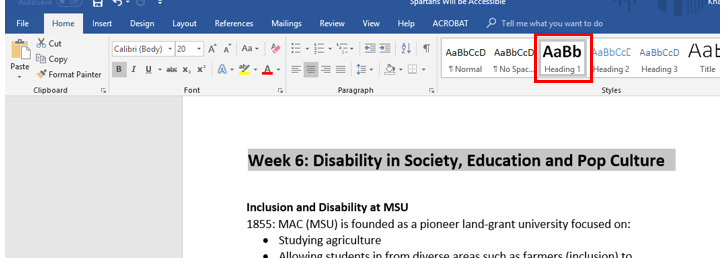
How to designate Headings and Normal Text in Microsoft Word:
-
Highlight the "Heading 1" of the document.
-
On the Home tab, select “Heading 1.” The Heading 1 was originally tagged “Normal.” Tagging the Heading 1 as a “Heading 1” will allow a screen reader to communicate the first heading in the document.
-
To create a Heading in the document, highlight the word or phrase.

-
Select the hierarchical level in the top ribbon on the Home tab. For example select, “Heading 1” or “Heading 2."
- Go through the document, tag similar headings within the same hierarchy the same heading element.
The font style of the word or phrase may change when tagging heading styles.
How to change the format back to the original formatting in Microsoft Word:
-
On the Home tab, there are font format options.
- Or, change the format for a Heading Style to keep it consistent every time a heading is selected.
-
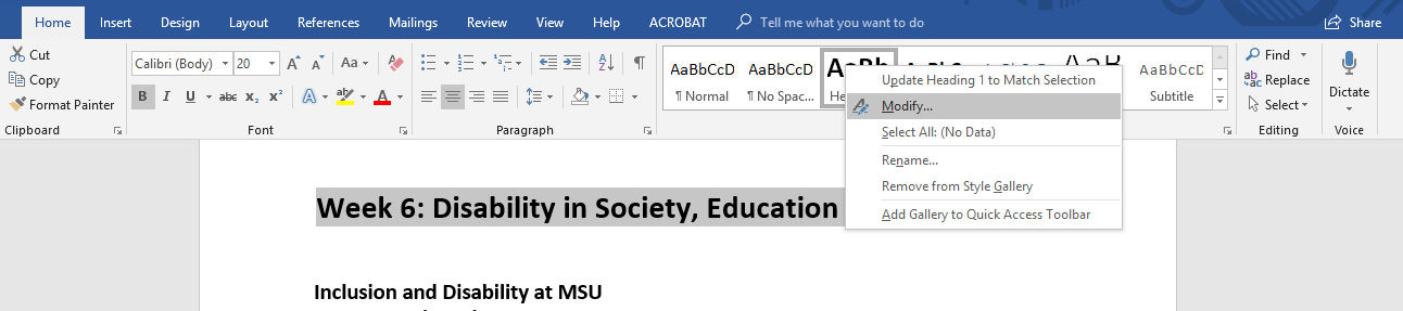
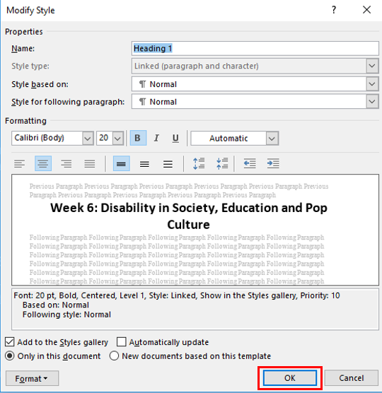
Right click on the Heading Style and select “Modify."
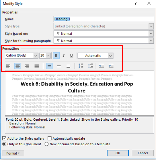
-
A Modify Style box will appear, under Formatting, change the font format.
-
Select “OK” to save changes.
-
-
Or, update the heading styles without changing your formatting. Right click on the Heading Style and select "Update Title to Match Selection."
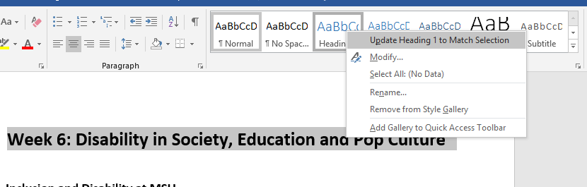
By doing so it will change the Heading Style while keeping your formatting consistent with how it already appears.
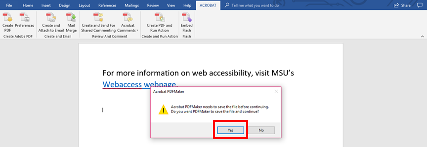
How to Properly Save to PDF
To save accessible features made in a Word document to a PDF document, you must save a Word document properly. Although there are many ways to convert a word document to a PDF, it is important to perform this action in a specific way each time to ensure that the accessibility practices implemented remain intact. To complete this action users, need to have Adobe Acrobat Pro installed on their device.
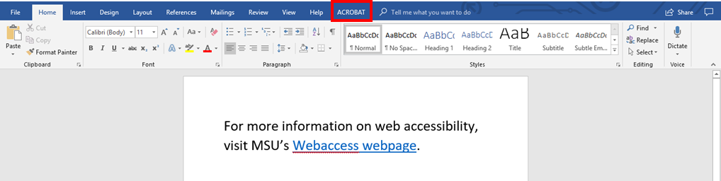
How to properly save a Word document to a PDF:
-
Select the Acrobat tab.
-
Select “Create PDF."
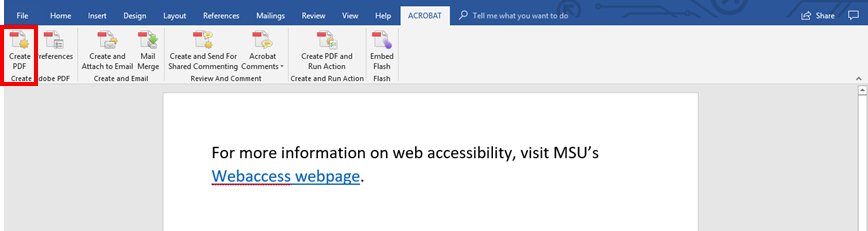
-
An Acrobat Create PDF box will appear.
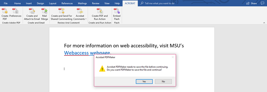
-
Select “Yes." Upon saving or selecting "Yes" the document will open in PDF. This gives the user the opportunity to review the document in its new format.
Word: List Styles
List styles are great tools to organize your content. Using built-in structures like bulleted or numbered lists allow assistive technology like screen readers to clearly convey information to users, and allows users to effectively navigate through content.
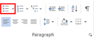
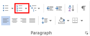
How to format lists:
- Select content to format.
- On the Home tab, select the Bullets or Numbering icon.
-
Use Bulleted (unordered) lists when items have equal value.
-
Top ribbon in Microsoft Word under home tab. List option highlighted from Paragraph section.
Bullets List Example:
- 1 cup of water
- 1 stick of butter
- 3 eggs
Numbering List Example:
- Heat oven to 350 degrees F
- Beat cake mix, water, butter, and eggs in large bowl
- Bake as directed
Word: Reading Order
The reading order is the order in which headings style elements on a page are read by assistive technology. Reading order is programmatic and should generally be read top, down, left, right for English text/diagrams.
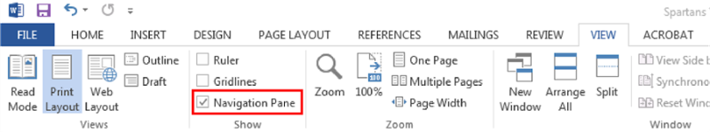
How to edit and change the reading order in Microsoft Word:
-
Open the Navigation Pane, by checking “Navigation Pane” on the View tab in the Microsoft Ribbon. A side bar will appear to the left.
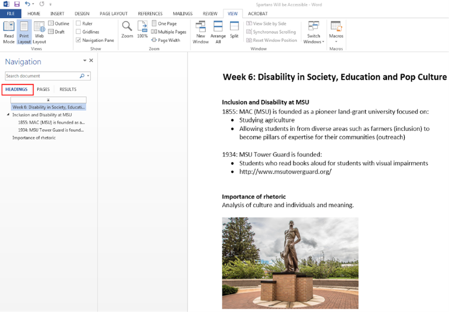
-
Select Headings on the Navigation pane. This will show the reading order of each heading style tagged in the document. (REMINDER: When organizing the reading order in Word, the title should be on the first line. The following lines should display Heading 1 elements. Subheadings for example, Heading 2, will display underneath a Heading 1 element, once the arrow is selected.)
- To change the reading order, select the content in the document and drag it to the correct order. The reading order will automatically change in the Navigation page.
-
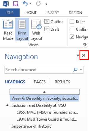
Close (X) the sidebar once the reading order is correct.
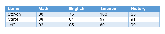
Word: Tables
When creating tables be sure to use a simple table structure, with column and row header information. This will allow individuals with assistive technology to understand the information that the table is providing and keep track of their location in the table.
Tips to create accessible tables:
- Include a title to describe what the table is representing
- Include at least one header row
- Do not leave blank rows or columns
- Do not split cells or merge cells
- Do not create nested tables
- Include alternative text
Additional items to consider:
- Color contrast
- If you have a table that has been embedded as an image, it is suggested to recreate the table in Word. This will allow an individual with assistive technology to navigate through the table, cell by cell. Also, it is more difficult to add alternative text to a table as an image, since it can get lengthy and provide an inaccurate representation of the data.
- Do not make the table too large. Complex tables can be difficult for readers to follow and comprehend, especially for individuals with assistive technology who have to remember headers.
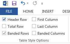
How to add header rows in Microsoft Word:
-
Select the table.
-
In the Design tab, under Table Styles Options, check “Header Row." Make sure that the first row is highlighted.
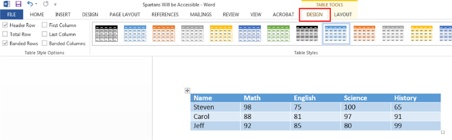
- Table properties tip: There is an additional setting within Table Properties that should be selected when using tables with a header rows. To find this setting, right click on the table and open Table Properties. In the Row settings under Options, check the box to “repeat as header row at the top of each page.”
Word: Text Styles
Text styles is the use of using more than color to denote the differences between content and the rest of the document. Meaning can not be denoted by color alone. A way around this would be to include text and color, shape and color, or bold and underlined and color. This will allow a visually impaired *individual to identify the differences between content meaning.
Wrong:
Turn in your final exam by Friday at 5 p.m.
Correct:
Turn in your final exam by Friday at 5 p.m.
Wrong:
Correct:
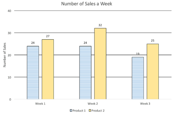
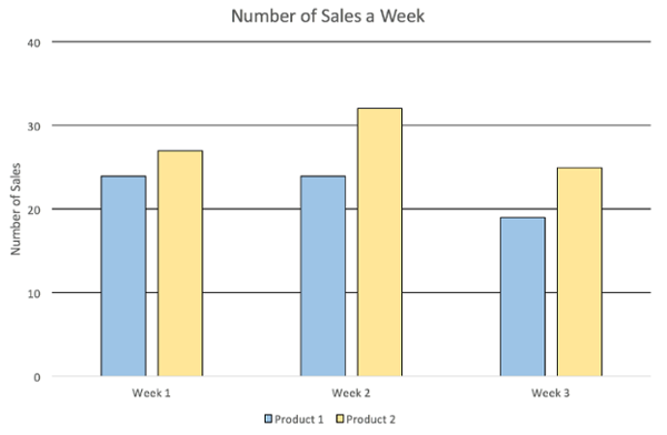
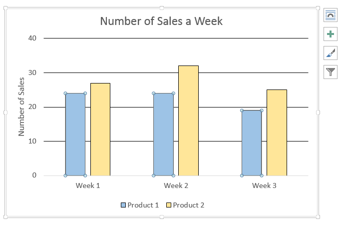
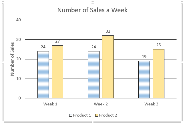
How to add a Pattern fill to a chart in Microsoft Word:
-
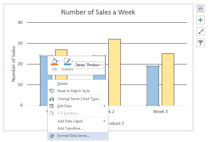
Select a bar to highlight, it should highlight all of the bars in the same group, four circles will appear on each corner of the bars.
-
Right click on the highlighted bar, a drop-down menu will appear, select “Format Data Series.”
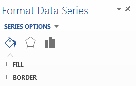
-
A sidebar will appear on the right, select “Fill & Line,” the first icon of a paint can with paint spilling out.
-
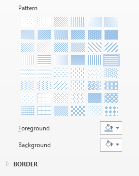
In the Fill section, select “Pattern fill,” a Pattern drop-down will appear.
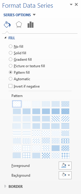
-
The appropriate pattern for your chart.
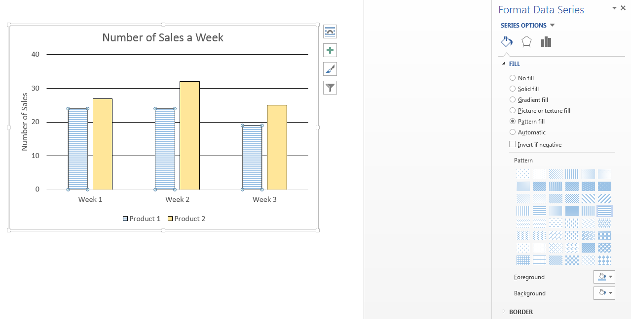
-
To change the pattern color(s), select the “Foreground” or “Background” drop-down of a paint can with paint spilling out.
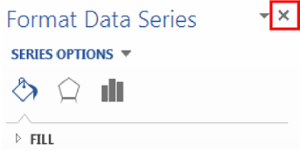
-
Close (X) the sidebar once finished.
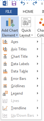
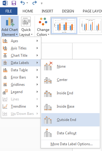
How to add Data Labels to a chart in Microsoft Word:
-
-
Select the chart, in the Design tab under Chart Layouts, select “Add Chart Element.”
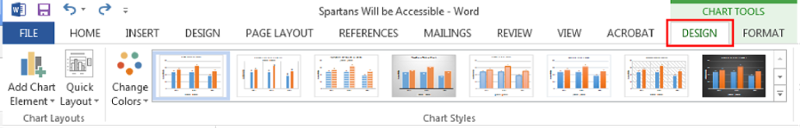
-
On the drop-down menu, select “Data Labels.”
-
On the second drop down menu select “Outside End.”
-
Word: Equations
Visit the MathType for Equations Tutorial for information on entering equations.
Word: Accessibility Checker
Microsoft Word contains a built-in accessibility tool. This allows users to perform a double check on their document to ensure that they have included all basic accessibility practices in their document.
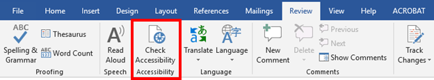
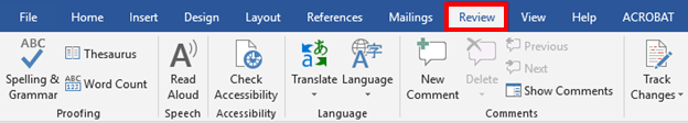
How to access the built-in accessibility checker:
-
Navigate to the Review tab
-
Under the "Accessibility" section, select the "Check Accessibility" button. This will run the tool and identify any accessibility-related errors that might still be left in the document.